Consulting Deck Redesign — A Commercial AI Operating Model, Rebuilt Slide by Slide
A dense strategy deck on scaling AI across commercial teams, rebuilt in a disciplined consulting grid — one message per slide, a consistent grayscale system, and a running framework marker so the audience always knows where they are.
- Role
- Presentation Designer & Strategic Editor
- Industry
- Consulting / Commercial Strategy
- Deliverable
- Redesigned executive deck (editable native file)
- Timeline
- 1 week
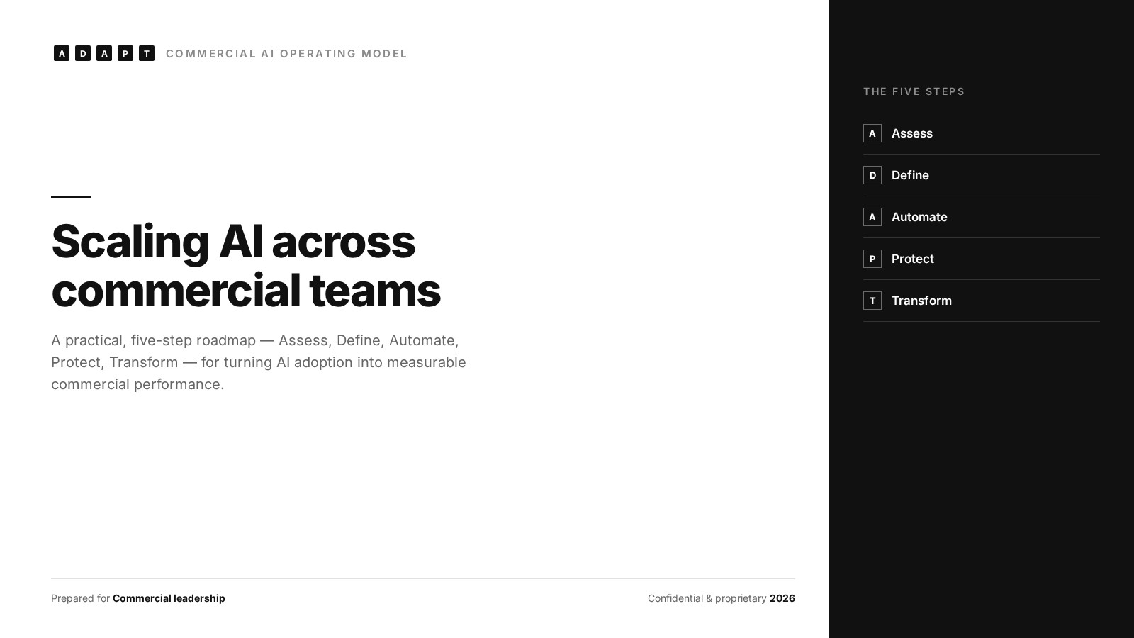
The challenge
The source deck had strong thinking and no visual hierarchy. Frameworks, personas, and a 15-step customer journey were crammed onto slides with mismatched typography, floating arrow shapes, and duplicated content — so the insight was there, but an executive audience had to work to find it.
- — Two unrelated ideas competing on a single slide — matrix plus manager playbook.
- — Mixed serif and sans type, inconsistent title sizes, and no shared grid.
- — Decorative arrow chevrons and clip-art icons doing the work headlines should do.
- — Duplicate rows and repeated content between slides — the same table appearing twice.
- — No slide numbers, section markers, or way to orient inside the framework.
- — One message per slide, written as an action title an executive can read alone.
- — A single grayscale system: one sans family, three type sizes, one 12-column grid.
- — A persistent A·D·A·P·T marker and page number so the audience tracks progress.
- — The 15-step journey rebuilt as a clean swimlane band by function and role.
- — Structure carrying the meaning — tables and matrices instead of decoration.
Slide redesign — before & after
Seven representative slides from the deck. Same content, same client thinking — restructured so each slide lands in a single glance.
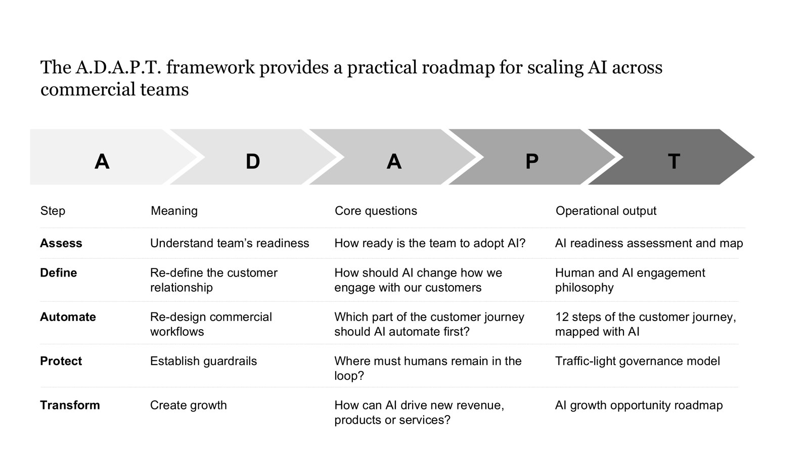
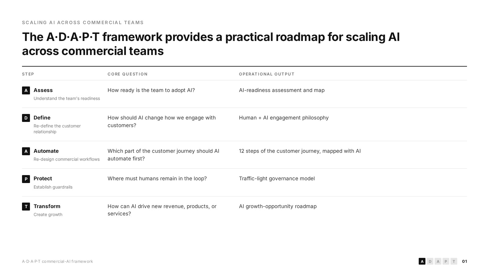
Chevron graphic and a loose four-column list replaced with a lettered step system, a clear step / question / output table, and an action title.
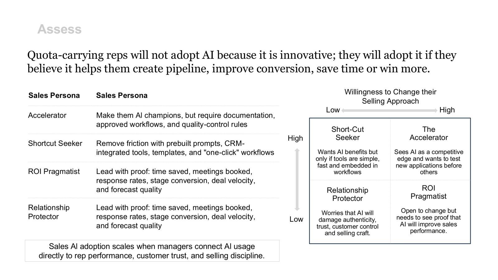
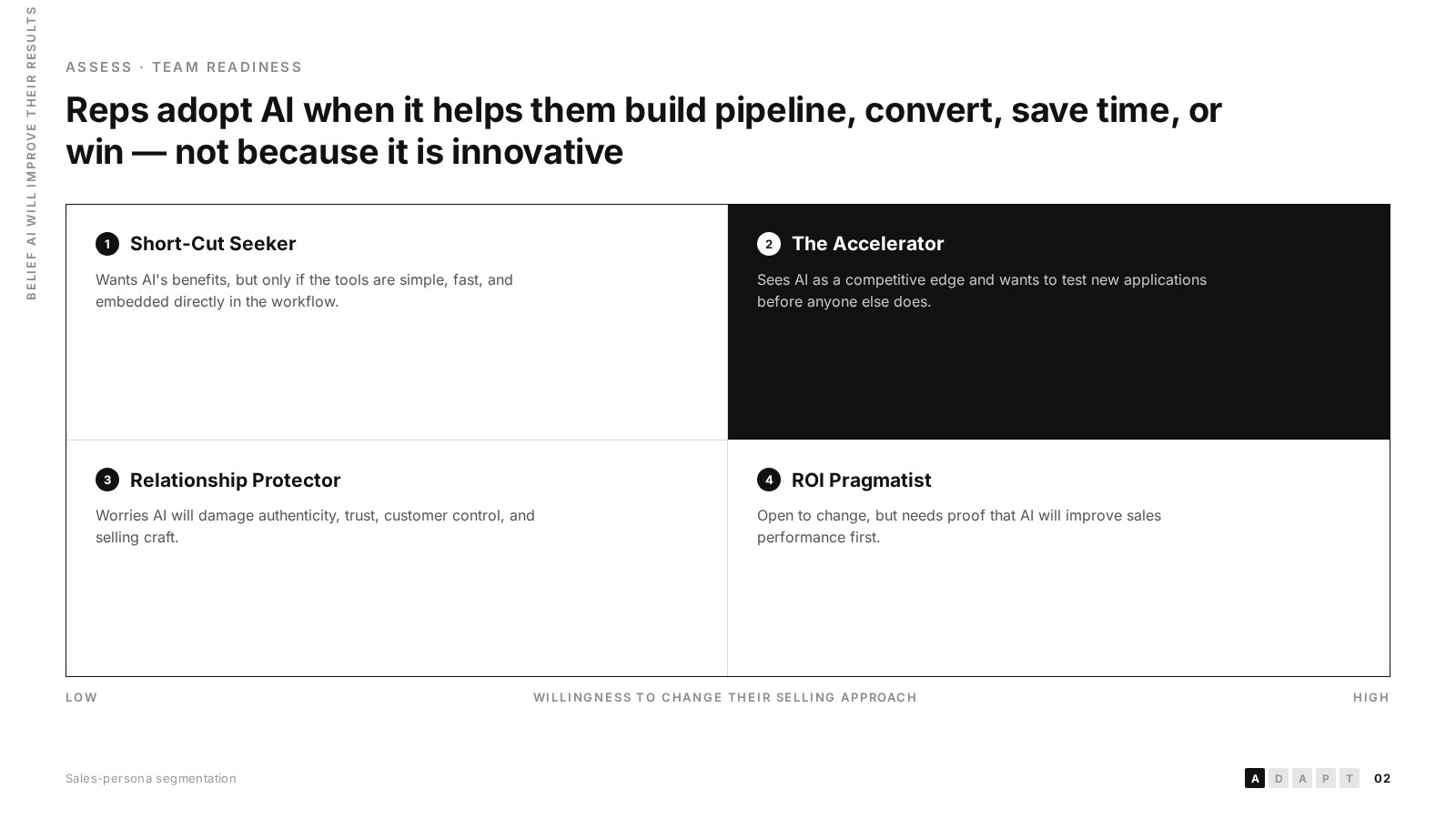
Two ideas were fighting on one slide. Split into a dedicated 2x2 belief-versus-willingness matrix with the priority quadrant inverted to black.
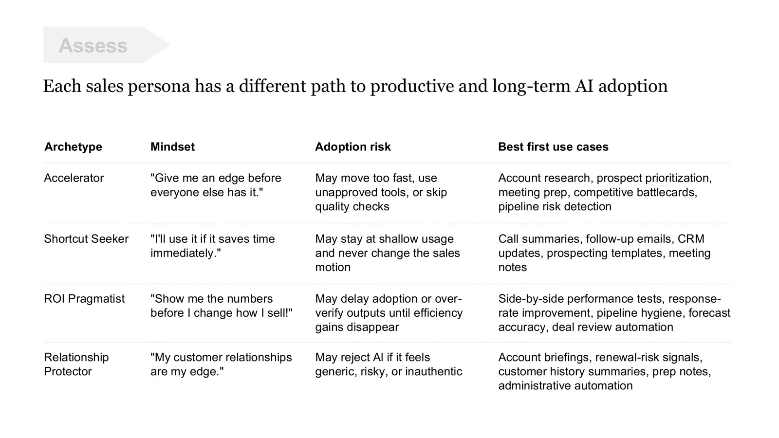
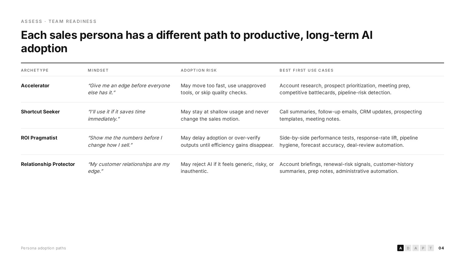
A duplicated table cleaned into one scannable four-column layout — mindset quotes italicized, risks and first use cases separated.
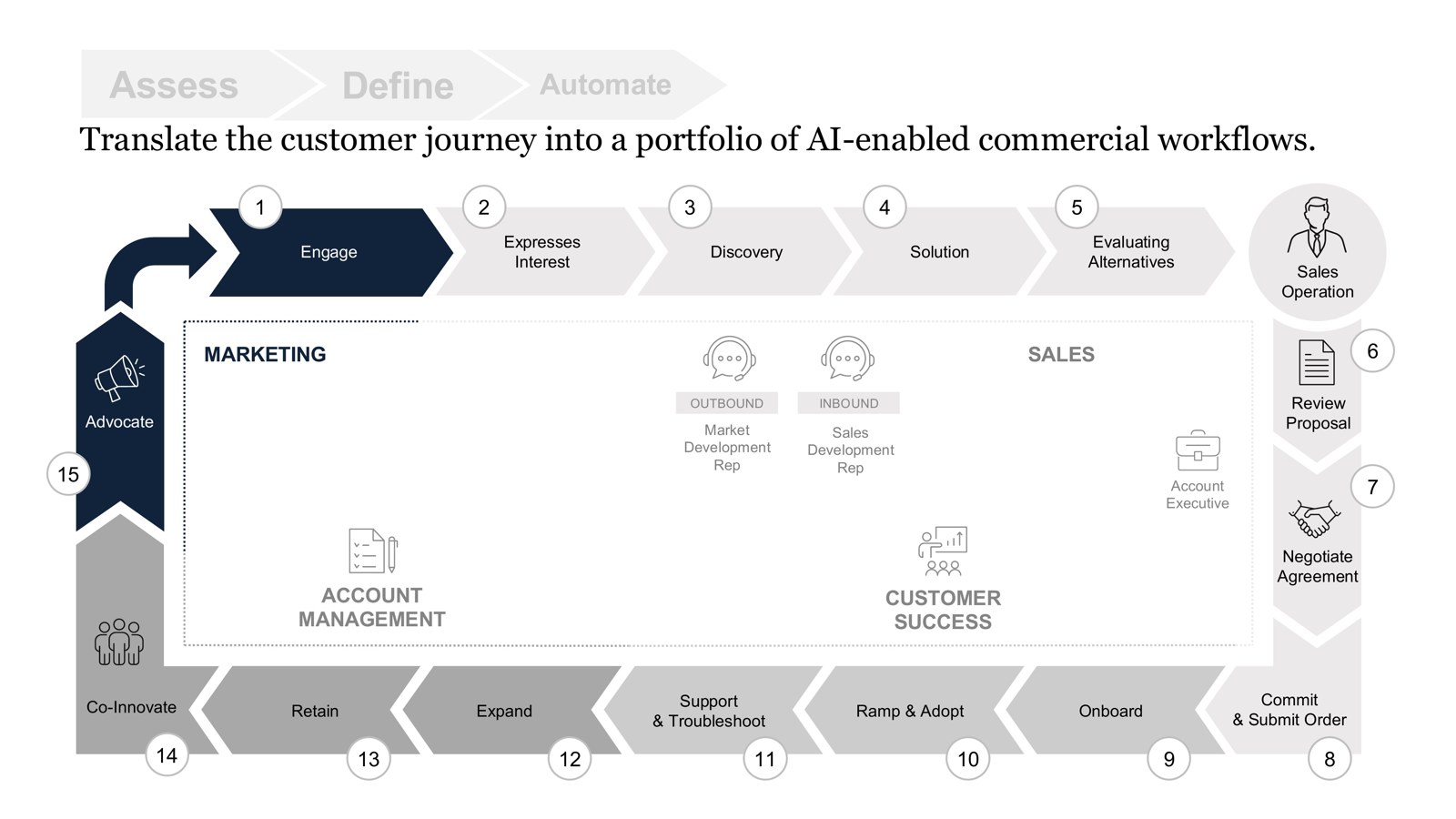
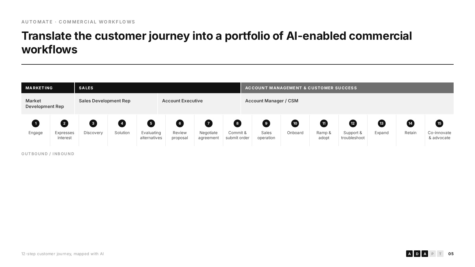
A circular arrow diagram with icons rebuilt as a linear 15-step swimlane, banded by function and owner so handoffs are visible.
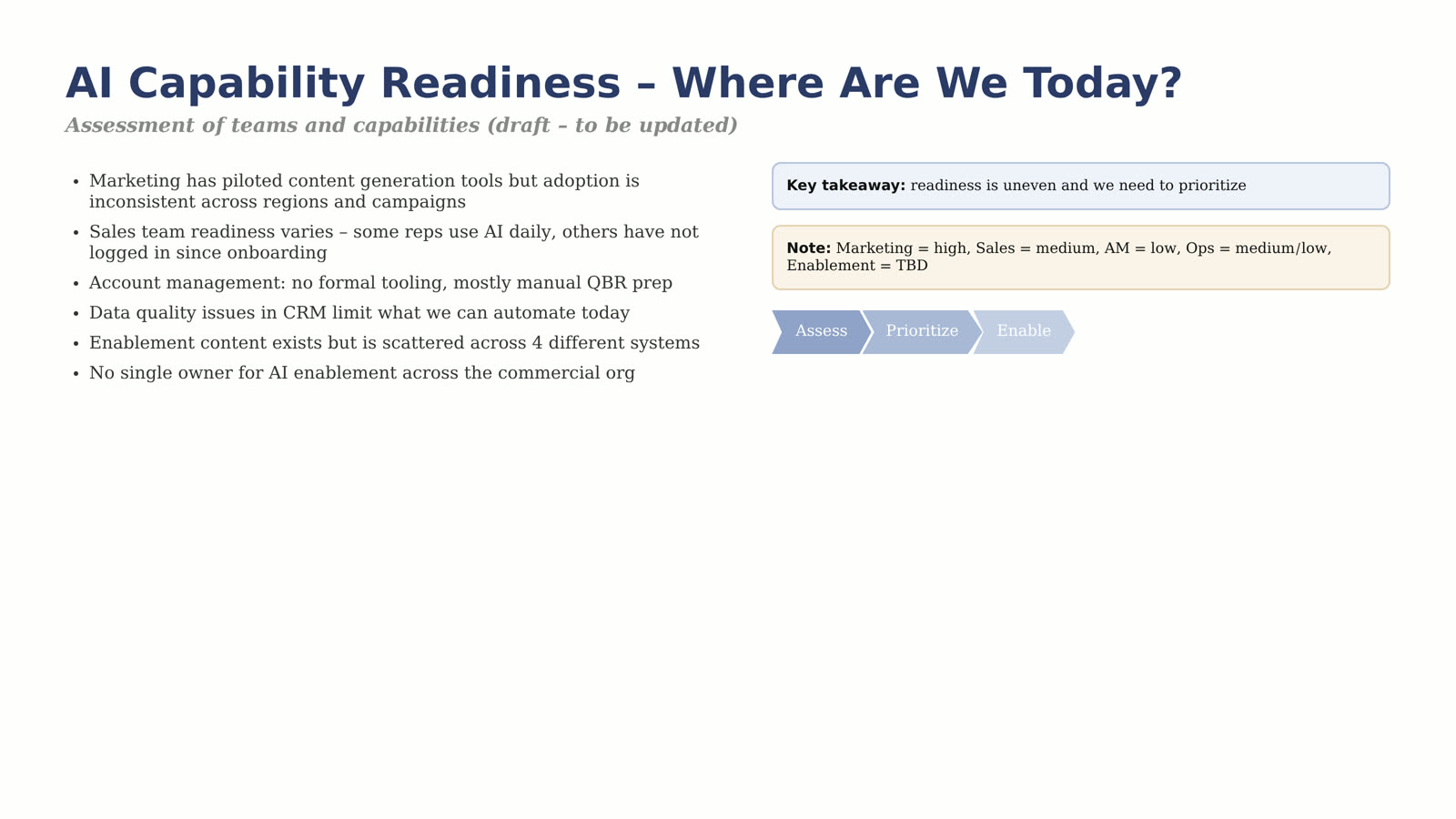
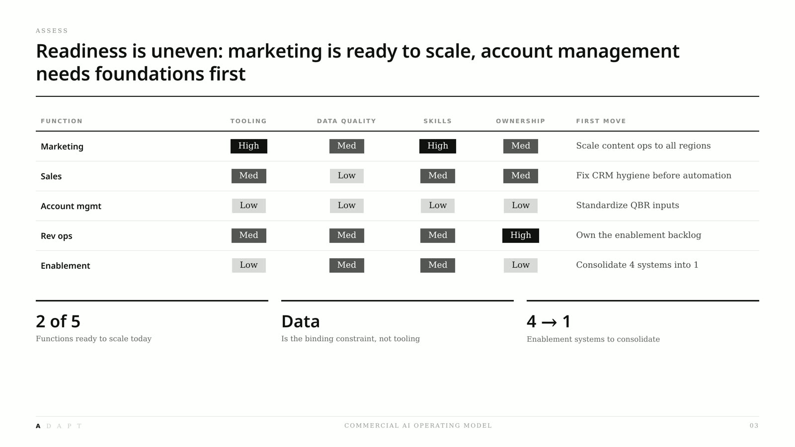
A six-bullet status dump and a color-coded side note replaced with a single readiness table — five functions scored on tooling, data, skills, and ownership, each with the first move named.
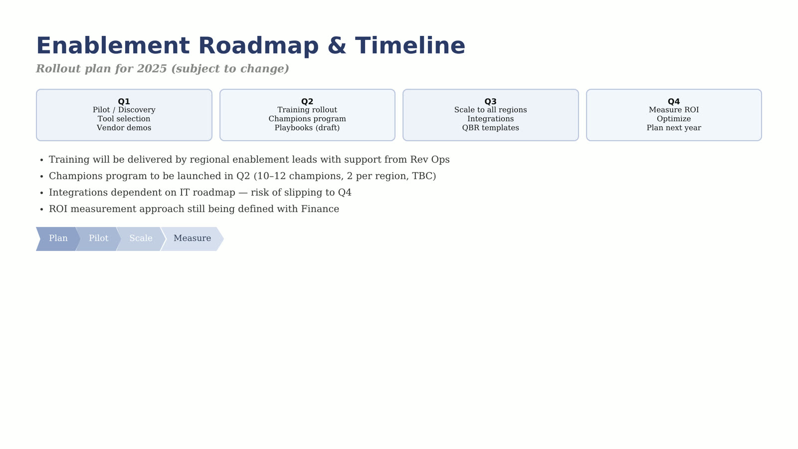
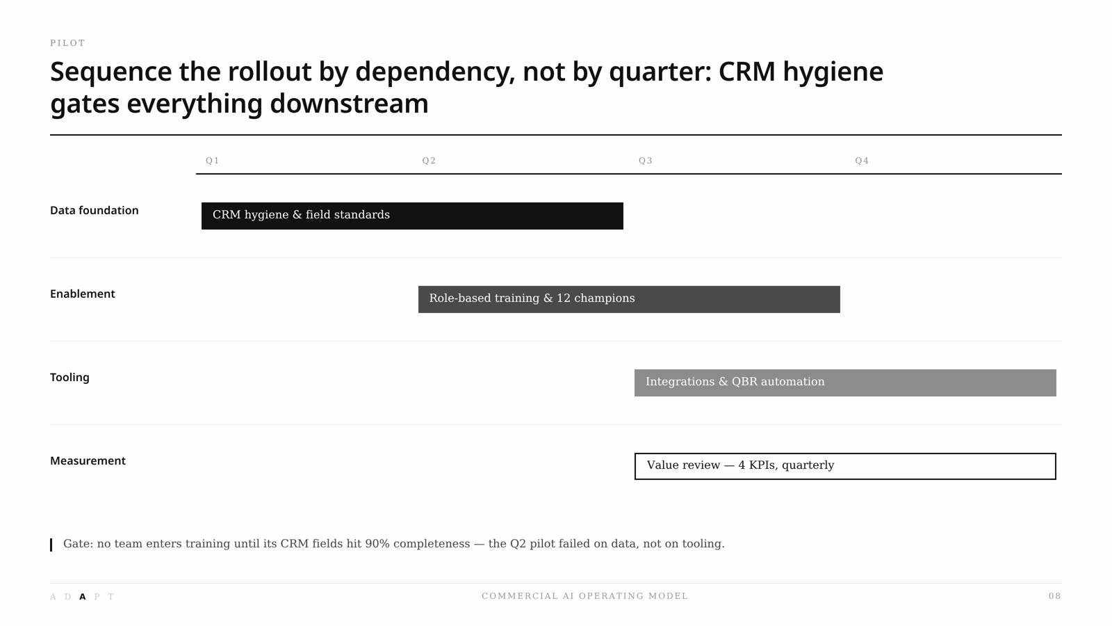
A four-box quarterly grid with caveat bullets rebuilt as a dependency-sequenced roadmap, so the audience sees what gates what instead of what happens when.
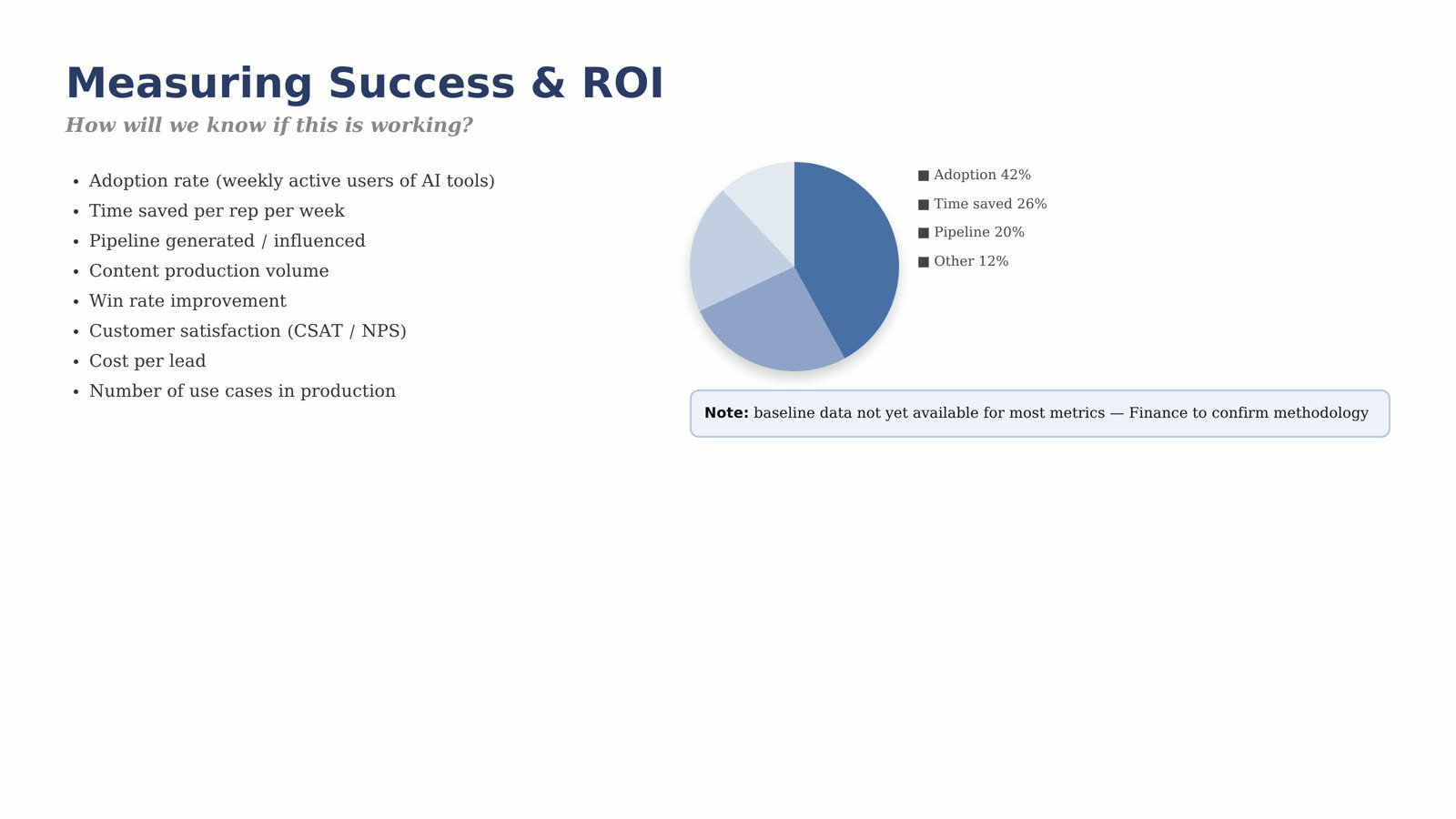
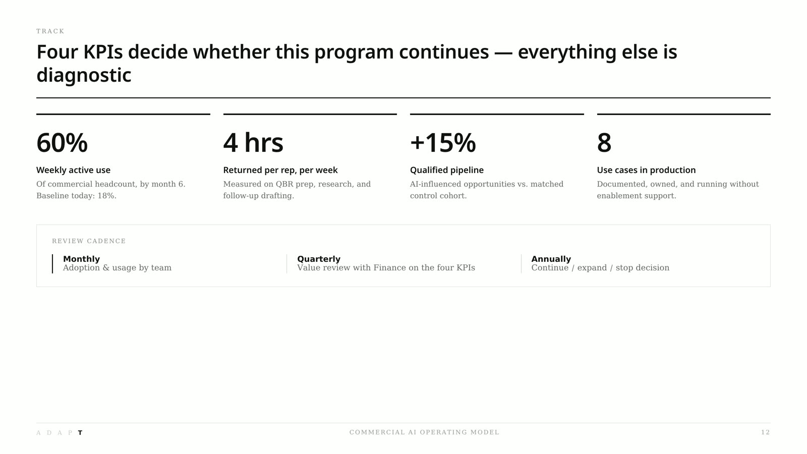
Eight candidate metrics and a 3D-styled pie chart cut to the four KPIs that actually decide the program, each with a target, a baseline, and a review cadence.
Skills applied & measurable results
- 6 → 1Visual styles consolidated into one system
- 15 → 1Journey steps compressed into a single swimlane view
- 100%Slides rewritten with a single action title
- 1 weekFull redesign delivered end to end
The approach
Every slide got a single action title before any design work started. If a slide needed two titles, it became two slides.
A grayscale palette, one sans family, three type sizes, and a consistent footer with a running framework marker and page number.
Chevrons, icons, and circular diagrams replaced with tables, matrices, and swimlanes that carry the logic themselves.
Delivered as a native editable deck on real text boxes and shapes — no flattened images — so the team can extend it without me.
Outcomes
“Same content, completely different deck. It finally looks like the strategy we're actually presenting.”
Client and company details are kept confidential per agreement. Slides shown are anonymized samples of the delivered work.
Book a free 20-minute consultation.
Tell me what you're building and what the deadline looks like. I'll reply within 24 hours with next steps — no pitch, no pressure.